That’s why I forced Shakespeare to add the halftime bell lol
I was talking about the defaults you see when you go to set the auto-close timer as a mod, not the countdown that shows up at the bottom.
Although since you asked, I would definitely prefer a more accurate countdown yeah. n days m hours works. Although imo it would look nicer if you changed the threshold for displaying hours vs days. i.e. display “48 hours remain” when there are 48 h left and “2 days remain” when there are 49 h left. I know it’s pretty easy to do that with momentjs which is what I assume you’re using.
Whoops, I misunderstood.
Yeah this should be doable after I get back - we’re using discourse’s built in defaults atm so will need some plugin/component.
You know how theres a jump to ability when clicking on the post number? It would be cool if you could make certain posts like easily jumpable to. Start of days, flips, lynches etc etc.
This is something we’ve thought about a decent amount and just haven’t come up with a good (easy to use and relatively time efficient to make) solution yet.
Immediate workaround: I think we’ll encourage hosts to put links to these events in the OP - that way you can reach them in at most 2 clicks (return to op, go to event). Maybe even make this a crowdsourcable thing so anyone (including players) can update it.
The most obvious method (ticks in the topic timeline that map to specific events) is nontrivial, especially if we want a game host to be able to input the ticks on their own without admin help.
A more realistic approach may be to have an editable text box that follows categories around when you scroll up and down, but need to think about the UX implications of that (definitely no space on mobile) on top of the coding ones - and it might be a lot of work to just save one click for the same amount of host effort (having to edit in relevant info somewhere).
For the design of our web app, it’ll obviously be designed with mafia-specific navigation in mind.
Edited an example into the first post of MS’s game: Dengeki Bunko UCanPick [DAY 3] [DL: 3/11 11 PM EST]
Might be even better to have it at the top of the post?
Maybe countdowners should be pickable to 24 hours instead of 12 hours
you cant /out with a poll
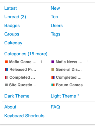
The Categories tag in the drop-down is a little confusing. I imagine it would be much more familiar if it was labeled something like “Home”, “Forum”, “Main”, or the like.
Not sure where you mean, are you talking about the “all categories” dropdown on the home page next to “all tags” or something else? I think all categories fits for that one because it literally is a list of all the categories.
If in terms of comfort you mean that word “categories” for forum subindexes not being the norm - we’re betting that it will be eventually with discourse steadily getting more popular.
I was referring to the dropdown menu on the top right. But you do have a point that Discourse is growing.
Ah okay - the categories page is just the default home page that we set for desktop (it’s latest on mobile). Users can customize what they want their home page to be on /preferences/interface so that link technically doesn’t always go to “home”.
dont let people post in games they arent apart of
solid suggestion
Yeah I’ll add that ASAP.
Need to test on private server then have to take site down for a little to add plugins etc.etc.
Good shit, discord login works like a charm
Deduce
I debate
I decieve
Will do this ASAP.
Briefly tried what I thought was the trivial solution last night and it didn’t work. >.<
