Moved them, how is it now.
Absolutely a awesome
Why is the underline tag gone though?
I have no further issues with the current mobile layout. Will check the computer layout later
limited space on mobile!
I think the other ones we’re showing right now on mobile are more essential than underline, or less intuitive to execute on their own. Underline wasn’t even packaged in default discourse haha.
What is preformatted text
I think the settings button can be removed on mobile —->
Apart from that I find it perfect
VOTE: horseUNVOTE:
Like it
Regarding your issue here: CUTIE MAFIA - SUPER SNUGGLES (SNUGGLE PHASE 2), I’ve temporarily changed the “error message” to include instructions on how to override it (append <br> to the end of your posts) - if the new error message isn’t appearing next time anyone gets a similar error, let me know.
Hopefully this solution isn’t too much of a hassle - we’ll try to get a plugin together that automatically overrides the feature in the future.
A few things:
-
The sidebar is cool, but it NEEDS major event tagging to be used in games. Like imagine the scrolling sidebar, but with “End of Day 1, End of Day 2” etc. A black dot you can click on and jump to that event
-
ISO functionality would be really nice.
-
Vote counter at the side of the screen would be nice. For current vote total. Probably a pita
Discourse has some built-in ISO functionality. If you click someone’s avatar in the thread, there’s a button with the number of posts they have in the thread. Click it to get all their posts.
You can also add @username in a topic search to filter by that user plus whatever other search criteria you want. “@fferyllt vote” would bring up all my posts with votes in the topic.
Event tagging (or something that works similarly) will be a thing in the hopefully not too distant future. Right now, I’m using bookmarks to keep track of key posts in a game. Also, when I host games, I’ll put links to daystarts/ends in vote count posts.
An automated vote counter is also in the plans.
Ffery basically covered most of it, building on some points:
-
The feature that will likely to come sooner than what you’re suggesting is to have a user’s bookmarked posts in a thread be indicated by a mark on the timeline. This way, in practice you can get the same effect by bookmarking the day end/start posts. Having the same set of specific posts, that the software has to figure out, indicated for everyone globally is harder. For example, having most-liked posts be globally marked would be relatively easier, but also more useless.
I’ve been thinking of building a quick fix which is to “paginate” by days (where in reality each day is a different topic, but they’re conveniently linked). The downside here is that iso/search will be segmented by days. We’ll probably have a topic up discussing this and other options for navigation soon. -
You can also access ISO’s by going to user profiles through the “frequent posters” summary box that’s at the bottom of any OP.
The two issues that exist right now are that click-based filter ISO isn’t a thing on default mobile view, and that the option doesn’t exist for posters with only 1 post in thread. We’re working on both, with the the latter being a lower priority. (Most people will have >1 posts in threads, and if not, the searching in thread for @username should suffice for a singular poster). -
The planned design for the votebot is that when a user posts @MafiaBot in a topic, a live vote count would be generated and posted by said bot. We probably won’t have a 24/7 live updated vote count.
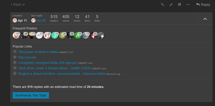
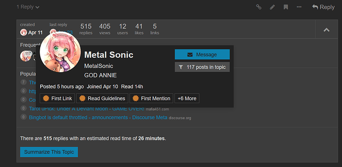
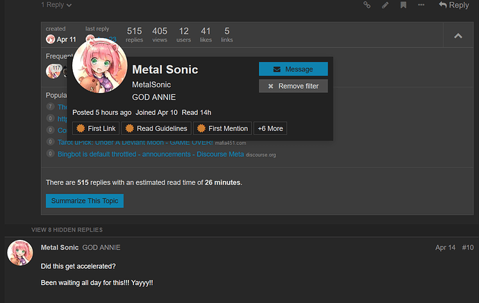
Visually, this is how you access the ISO functionality.
What it looks like by default:
After you’ve clicked the expand arrow:
Now, I selected a player:
Now, I click “xxx posts in topic”:
To remove the filter:
A note: Summarizing a topic uses a filter to show the most read/liked posts in a thread. Not sure how it works e.e
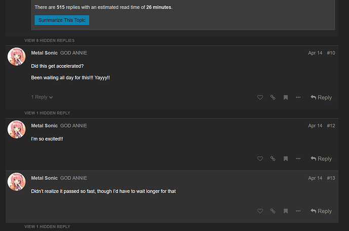
Also, you can click the text where it says ‘view x hidden replies’ to get the context between a user’s posts without undoing the filter.
when one ISOs, is there a way to get the thread to return to its normal view (other than me going back to Latest Posts and selecting thread again) ?
Yes. You can click on any avatar visible in the thread and instead of the button with the number of posts, you’ll see a button that will let you remove the filter.
I’ll add that to my image post some time tonight
Test:
Unless I’m missing some other way to do this, it would be nice to have a single button somewhere on the page we can click to clear the filter, or making it so you can click the thread title at the top and it clears the filter. It feels a bit unwieldy trying to find a user icon and then clearing the filter from there. Again, I might have missed something but I think I was reading a post a while ago where it said that was the way to clear the filter.
What do you mean by unweildy/trying to find an icon? The clear filter option should be available from any single post so should be 2 clicks away at all times.
Making it 1 click is something we can try to do in the (maybe even near) future but we’re prioritizing stuff that can’t be done over click reduction in the short term.
I know I’m likely in the minority here, but sometimes I prefer to use the desktop version of a site when I’m on mobile. Unfortunately, that doesn’t seem to be possible with Discourse! Requesting the desktop version of the site just gives me a slightly larger version of the mobile site. This means there are certain things which are totally inaccessible on mobile, such as the discord and twitter links in the blue top nav.
There’s a desktop view in the bottom of the hamburger menu. Be warned its super funky atm since a lot of our desktop components aren’t properly scales for mobile screens.
We actually removed the blue banner from mobile because it looked bad and took up tons of space. l’m out for most of the day but I’ll try to add the relevant links to the hamburger menu tonight.
We’re focusing on making the default mobile view not suck as much first - what makes you prefer desktop view? (i.e. what can you do well there that you can’t on mobile, the big ones we’re working on are ISO and jumping back to post replies).


